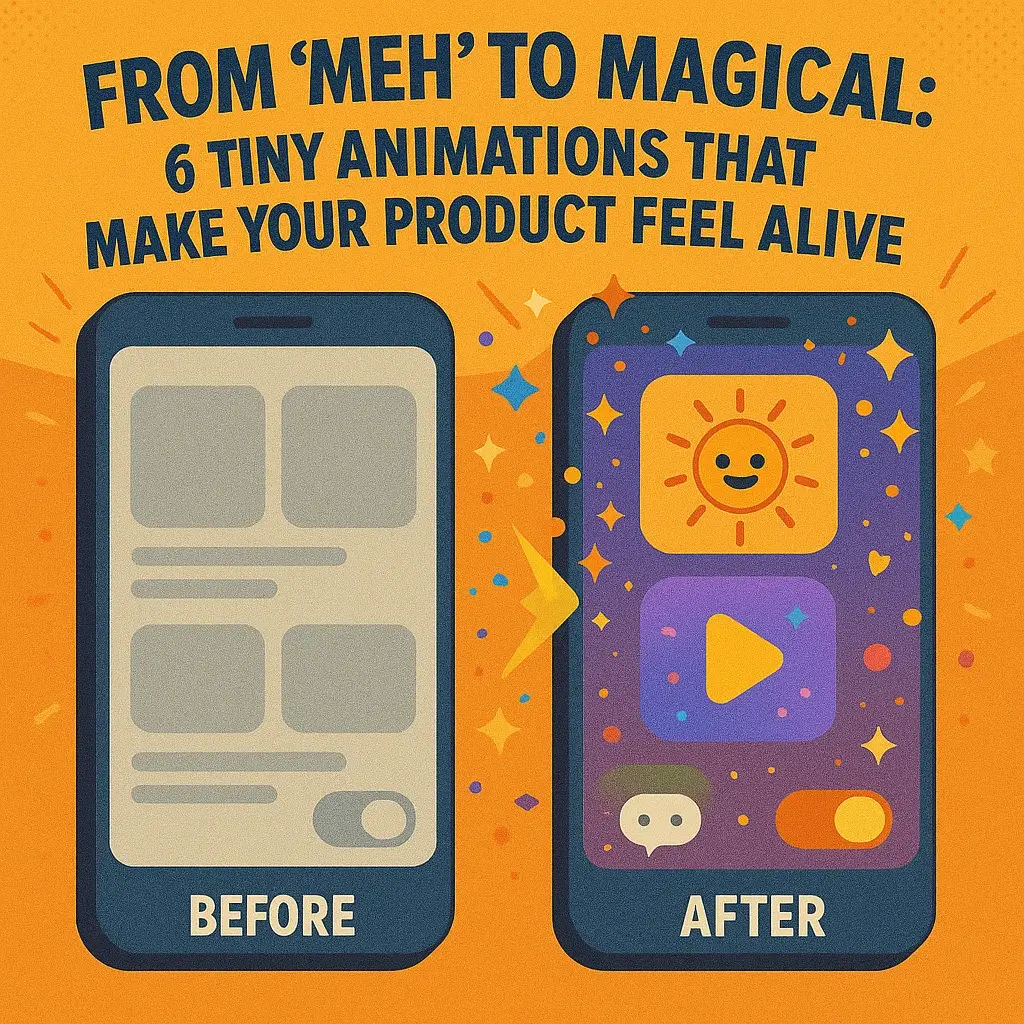
Ever used an app or website that, despite working fine, just felt a bit lifeless – leaving you with a “meh” impression? Now think of one that made you smile at every click or tap, with little surprises that brought the interface to life. The difference often lies in micro-interactions – those subtle, tiny animations that give you feedback and delight in the moment. In the words of UX experts, “although small, these animations can turn tedious actions into memorable moments” by making a product more intuitive, engaging, and fun. In this article, we’ll explore six such tiny animations (for both web and mobile) that can transform your product from meh to magical – and how they add that spark of life.
1. Buttons that Invite Interaction (Hover & Press Feedback)
A subtle hover animation can instantly make an interface feel more interactive. For example, on Hootsuite’s dashboard, cards will ‘jump’ up slightly when you hover over them, almost as if your cursor is a magnet pulling them up. This playful bounce visually indicates that the element is clickable, improving usability at a glance. Tiny cues like this turn a static UI into an engaging experience, reducing “rage clicks” by clearly differentiating interactive elements from static content.
Don’t let your buttons and links just sit there static – let them wiggle or respond! Even a simple change, like a button that gently changes color, grows a shadow, or bounces ever so slightly when you hover or tap, can make an interface feel alive. On the web, a call-to-action button might subtly animate when you hover over it, drawing your attention and encouraging you to click. On mobile, you’ve likely noticed buttons that briefly press down or ripple when tapped – it’s the UI’s way of saying “Yep, I heard you!” These micro-animations both delight the user and provide immediate feedback that an action is being registered. The best part? They’re often easy to implement with simple CSS transitions or lightweight libraries. In other words, no need for heavy code – a few lines of styling or a snippet from an animation library (like Framer Motion for React) can make your buttons go from boring to inviting in no time.
2. The “Like” Button That Loves You Back
Clicking a like or favorite shouldn’t be a dull affair. Many modern apps add a dash of emotion to this simple action – essentially making the like button “like you back.” For instance, on Instagram when you double-tap a photo, a heart icon blooms with a soft animation, quickly letting you know your love has been registered. Twitter’s heart similarly bursts into sparkle animations, and Google went so far as to have its “Like” button send a burst of confetti across the screen to celebrate the tap. These tiny animations do more than just look cool; they create a mini emotional moment. That satisfying “pop!” of a heart or the playful confetti shower can even trigger a small dopamine hit, subtly encouraging users to engage again. In short, the interface feels responsive and appreciative, as if it’s saying, “Thanks for that!”
Beyond being fun, animated likes serve a UX purpose: they provide instant feedback. Without them, you might find yourself double-checking if your click went through. With them, it’s unmistakable – the bounce or burst is your confirmation. Designers often recommend keeping these animations snappy (often under 200 milliseconds) so they feel crisp and don’t interrupt the flow. Implementation-wise, this can be achieved with CSS keyframe animations or small SVG animations. Many apps also use libraries or built-in UI components for these (for example, Lottie files or OS-native animations) to get smooth effects without much effort. The tone can match your brand – a professional app might do a simple checkmark or a subtle pulse, while a playful app might throw around colorful confetti. Either way, a well-crafted “like” animation turns a tiny interaction into a memorable moment of delight.
3. Whimsical Waiting Indicators (Loading Animations & Typing Dots)
Even waiting can be engaging. In chat apps, for example, those three bouncing dots (as seen above in HubSpot’s chatbot) let you know someone – or in this case, some bot – is typing a reply. This simple animated cue mimics a human conversation pause, keeping users engaged and reassured that a response is coming. It’s a friendly visual whisper: “hang tight, I’m on it.”
No one likes to wait, but sometimes it’s unavoidable – pages need to load, data needs to process. The trick is to make waiting almost fun. Instead of a blank stare at a frozen screen, give your users a little something to watch. Many products use creative loading animations to achieve this. Slack, for instance, displays witty progress messages (often in the form of inside jokes or team quotes) to keep you amused while your workspace loads. The language-learning app Duolingo is famous for its mascot, Duo the owl, doing a playful dance or animation while you wait for a lesson to load. Even a simple progress indicator can have personality: YouTube’s buffering bar isn’t just a plain progress bar, but a red line that zips across the top of the screen, giving a sense of forward motion and reassuring you that your video is on the way. On mobile, think of the classic pull-to-refresh gesture – as you pull down, a spinner or an icon might stretch or rotate, then snap into a loading indicator once released, providing immediate visual feedback that your swipe is fetching new content.
The key benefit of these micro-interactions is communication. They answer the user’s unspoken question: “Is anything happening?” A lively spinner, a bouncing dot, or a quirky loading illustration all say “Yes, loading… just a moment!” This keeps users from feeling forgotten or assuming the app is unresponsive. Research has shown that when users see a responsive, animated loading indicator, they perceive the wait time to be shorter and less frustrating. From a technical standpoint, adding these animations is usually straightforward – it could be a CSS animation loop, a lightweight GIF or Lottie animation, or a small bit of JavaScript that toggles classes for your loading states. Just ensure the style matches your brand. If your product is playful, you have license to add humor or character (think Slack’s jokes or a mascot animation). If your product is more serious, even a well-designed skeleton screen (those gray placeholders that mimic content) can do wonders to make waiting feel purpose-driven and calm. Whimsical or not, a good waiting animation shows your product cares about the user’s time – and that makes your app feel more alive.
4. Delightful Toggle Switches & Icon Transitions
Flipping a switch in a user interface can be oddly satisfying when done right. Rather than an abrupt change from one state to another, a tiny animation on toggles can convey “the switch has been flipped” in a tangible way. Picture the classic toggle switch for settings (common in both mobile and web UIs): when you tap it, the knob slides smoothly from “off” to “on,” often accompanied by a color change from gray to a vibrant color. That little slide and color cue immediately communicates the state change to the user. It’s not just eye-candy – it’s functional. A simple animation, like the slider moving and a color shift, instantly confirms the toggle is now ON or OFF, so the user isn’t left guessing. For example, imagine toggling your Wi-Fi setting: if the switch snaps to the right and lights up, you know you’re connected without needing additional text confirmation. This clarity is exactly what a micro-interaction should achieve – feedback with flair.
Beyond switches, consider other state-change animations: the beloved “hamburger” menu icon (≡) that transforms into an “X” when you open a menu is a fan-favorite. Instead of simply swapping icons, the three bars elegantly morph into a cross and back again when the menu closes. This not only looks cool, but it also visually links the two states (open vs. closed menu) in the user’s mind. It’s a clever little dance that makes the UI feel thoughtful. Another example is a dark mode toggle that animates from a sun icon to a moon icon – a fun way to illustrate the mode change. These transitions, though only a few frames of animation, add a sense of smoothness and polish to the product. Users might not consciously notice every detail, but they feel them; the app just feels more responsive and modern.
From an implementation perspective, toggles and icon animations are relatively easy to pull off. Many platforms have built-in support for animated state changes (for instance, iOS’s UIKit switches have a default animation, and Android’s Material Design components as well). On the web, CSS transitions on a checkbox (styled as a switch) can handle the sliding motion and color change. For the fancier icon morphing, SVG animations or JavaScript libraries (like GreenSock or Framer Motion) can interpolate one shape into another. The advice here is to keep the timing quick and consistent – typically in the 150ms to 300ms range – so it feels snappy. Done right, these delightful toggles and transitions make every switch feel like a tiny accomplishment rather than just a click.
5. Friendly Form Feedback (Validation & Error Animations)
Few things are more aggravating than filling out a long form, hitting “Submit,” and then being told you made a mistake – somewhere. Micro-animations to the rescue! By weaving in instant, friendly feedback into form fields, you can turn a potentially frustrating experience into one that’s almost enjoyable. For example, when you enter a wrong password or an invalid input, the interface can give a gentle nudge: the field might shake side-to-side for a moment, like a head shaking “no,” to signal there’s an error. Often this is paired with the field outline turning red or a small error message fading into view. This little shake animation is far more effective (and human-like) than just a static error message popping up – it immediately draws your attention to where the issue is and hints “Oops, not that!”. It’s the digital equivalent of a friend tapping you on the shoulder to point out you missed something, rather than letting you blunder on.
Good form micro-interactions aren’t limited to errors; they also celebrate success. As you fill in each field correctly, you might see a tiny checkmark appear or the field border turn green to say “yep, looks good”. This inline validation gives users confidence as they go, so they’re not left guessing whether they did it right. A great real-world example is Simplenote’s sign-up form, which uses micro-interactions to instantly communicate what password requirements a user hasn’t met before they hit submit, saving them from the dreaded submit-fail-repeat cycle. Another fun example is the app RememBear: it has a bear mascot for security, and when you type a wrong password, the cute bear icon actually turns red and frowns, shaking its head; type the correct password and it turns green and smiles. It’s an adorable twist on form feedback that softens the blow of an error and rewards you for getting it right, all in one glance.
The overarching goal with form animations is to be helpful and human. They should guide the user through completing the form, reducing anxiety and errors. When implementing these, consistency and subtlety are key. A shake animation or a fading tooltip can be done with simple CSS animations or JavaScript event handlers that add a CSS class on validation failure. Libraries exist that can do things like animate input borders or icons easily, too. The design tip here: keep it subtle and non-intrusive (you want to assist, not startle). As one UX guideline puts it, micro-interactions in forms should “provide instant feedback to confirm actions or alert when something is wrong, without overwhelming the user”. When users feel like the form itself is guiding them kindly – almost like it’s alive and attentive – they’re much less likely to abandon it out of frustration.
6. Celebrating Success (Tiny Rewards & Surprises)
Finally, let’s talk about adding a pinch of celebration when the user achieves something. These are the little “Yay!” moments that can turn a mundane task into a memorable event. The idea is simple: when a user completes an important action or reaches a milestone, acknowledge it with a fun animation or delightful response. Did the user just finish onboarding or complete a tough to-do? Maybe a few pieces of digital confetti drift down the screen, or a cheerful icon pops up with a smile. These tiny celebrations can make your product feel like it’s truly rooting for the user. Mailchimp famously does this by showing a jubilant high-five animation from their mascot Freddie when you successfully send out an email campaign – along with a “Rock on!” message to congratulate you. It’s completely unnecessary from a strictly functional perspective, yet it leaves people feeling awesome about their accomplishment (and about Mailchimp by extension). Similarly, many fitness apps shower your screen with stars or play a satisfying ding! when you hit your daily goal. These are small pats on the back, but they resonate emotionally.
Why sprinkle in celebrations? Because emotion matters. Accomplishing something – even as simple as filling out a profile or checking off a task – triggers a sense of progress in users. A celebratory micro-interaction amplifies that good feeling and ties it to your product. Users are more likely to remember an app that made them smile or feel proud. In UX design, this is often called designing for delight, and it can foster a positive feedback loop. A quick burst of confetti or an upbeat animation upon success reinforces to the user that they did the right thing and encourages them to keep engaging. Studies in user experience note that these positive moments can increase overall satisfaction and even loyalty, because they create an emotional bond between the user and the app. Of course, moderation is key – the celebration should be a tiny reward, not a lengthy interruption. A rule of thumb is to keep these animations brief and on-brand: a quirky app can get away with a silly dance animation, whereas a more serious product might go for a simple congratulatory message with a subtle graphic. Technically, adding such animations might involve triggering a one-time animation (CSS or Lottie files work great) when a certain event completes. Many libraries and frameworks allow you to animate on state change, so you could, say, tie a confetti burst to a form submission success event with minimal fuss. It’s a small investment for a big impact – turning user success into a shared celebration between the user and your product.
In conclusion, it’s often the tiny touches that turn a user experience from meh to magical. These little animations – whether it’s a button’s wink, a loading screen’s playful wink, or a celebratory high-five – all work together to make your product feel responsive, human, and alive. Micro-interactions like the ones we’ve discussed support the user by providing visual feedback and personality at just the right moments. They reassure, guide, and even amuse your users, helping you stand out from competitors with an experience that’s memorable and engaging. Best of all, you don’t need a Pixar-sized animation team or a heavy codebase to implement them; a bit of creative design and a few lines of code are often enough to bring these magical moments to life. So go ahead – add that hover bounce, that loading whimsy, or that confetti cannon. Your users might not thank you outright, but their smiles (and increased engagement) will say it all. Here’s to making your product feel truly alive, one tiny animation at a time!